Company
Aqua Scan / Premio Innovar
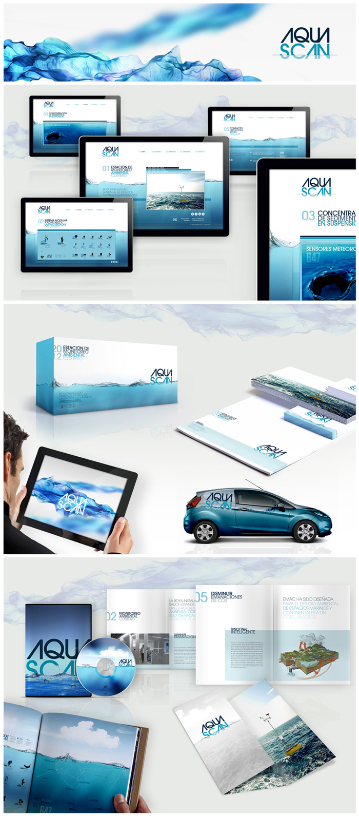
The choice of the name aims to be highly communicative and improve its recall, besides being easy to read and pronounce. With a clear message, reinforced from its morphological treatment, its name makes direct reference to its function. The logo aimed to achieve a high visual impact based on its shape, chroma, and treatment. Morphologically, the visual effect (diopter) produced by partially submerging an object in the water is simulated. This concept is reinforced with the chromatic palette, by using a lighter color in the lower, "submerged" part. Con el logotipo se propuso lograr un alto impacto visual basado en su forma, croma y tratamiento. Morfológicamente se simula el efecto visual (dioptrio) que se produce al sumergir parcialmente un objeto en el agua. Este concepto se refuerza desde la paleta cromática, al utilizar un color mas claro en la parte “sumergida” inferior.